What is mobile-first indexing and how does it work?
Google announced their mobile-first indexing policy for the first time in November 2016. Today, it’s a global standard for all websites (or rather – their mobile versions). But what does mobile-first indexing actually mean? How does it affect the mobile version of your site? And what can you do to thrive in Google search after it was implemented? Let’s find out!
To understand why mobile-first indexing was implemented, you have to know how Google works and what is its major goal. Google always wanted to provide its users with the best search results available. And how are people looking for information today? More and more often – on their mobile phones. This means that mobile indexing was simply necessary.
Take a look at the chart below and see how mobile search results are becoming crucial in today’s online world:
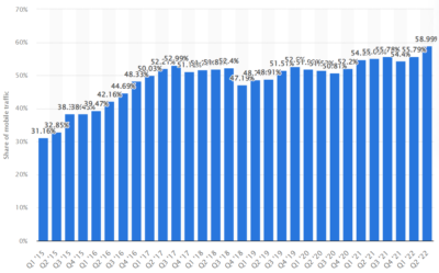
As you can see, as of Q2 2022, almost 60% of the global online traffic happens through mobile devices – smartphones and tablets. For Google, it was a natural step to emphasize the importance of mobile pages. Let’s talk a bit more about this new policy concerning mobile sites.
What is mobile-first indexing?
Back in 2016, Google experts wrote on their blog: „Although our search index will continue to be a single index of websites and apps, our algorithms will eventually primarily use the mobile version of a site’s content to rank pages from that site, to understand structured data, and to show snippets from those pages in our results”.
So, in essence, mobile-first indexing means that Google bots index the mobile version of your website, not the desktop version. In other words, now your mobile site is the primary website. Does it mean that now Google uses two different indexes? No, there is just one index, and although Google indexes the mobile site, it shows the URL that’s the best for a specific user – sometimes a desktop one, and sometimes a mobile one.
When was mobile-first indexing introduced? At first, Google planned to enable mobile-first indexing for all websites in search in September 2020. In July 2019, mobile-first indexing was introduced for all the new websites. Later, Google decided to extend the timeframe to the end of March 2021, and that’s the actual starting date of the mobile-first indexing policy. In general, this indexing method means that both mobile and desktop versions of your site need to be flawless and intuitive. We’ll talk about that a bit more in a few minutes.
How can you prepare for mobile-first indexing?
If that’s the first time you hear about mobile-first indexing, you need to act quickly and implement some changes to your website. What does it mean in practice?
CHECK YOUR MOBILE-FRIENDLINESS
As a part of mobile-first indexing, you have to make sure that your mobile website is fully mobile-friendly. How can you check that? For starters, use this free tool that’s a part of the Google Search Console. If you get the green result – you’re all good. If not, implement recommendations that this tool suggests after the test.
MOBILE USABILITY
In short, your mobile page has to be fully useful. This means that it should be functional and contain the same primary content as the desktop version. If the mobile version of your website has less content than the desktop version, you should update it so that its primary content is identical.
At this point, you might ask what the primary content actually is? The answer is two-fold:
- It’s the content you want to rank with on Google;
- It’s the content you want to attract customers/users with.
Robots meta tags are used to control how all individual subpages should be indexed and displayed to Google users. In other words, it’s how Google bots see your websites and their content. You should always use the same robots meta tags on the mobile version as those on the desktop version.
THINK ABOUT LAZY LOADING
In general, lazy loading is all about deferring the loading of non-critical or non-visible content. This means that you should implement it only to elements that are not critical. For instance, if your desktop website has ten images on the main page, you can think of putting just two of them in the mobile version and showing additional eight images only after the user clicks the „+” or „show more” button. This way, your website will load faster, and that’s a crucial element of mobile-first indexing. Never apply lazy loading to primary content or primary functions of your website!

MOBILE URLS
Some of your resources can have different URLs on the mobile version. In general, that’s not a big problem. What you should do, though, is verify whether you’re not disallowing crawling (i.e. blocking) them with the robots.txt file. You can also check your URLs with Google Search Console.
If you use different URLs, ensure a few things:
- The error page’s content should be the same for both mobile and desktop websites;
- The mobile version of your website shouldn’t have so-called fragment URLs (they are not indexed);
- If you have several desktop versions of your website that serve different contents, they need to have equivalent mobile versions.
THE SAME HEADINGS
The mobile website should be as similar to the desktop one as possible. This comprises the same headings, which, as we all know, play a vital role in your website’s visibility on Google. This means the same heading tags (H1-h4) and the same content of each heading. And don’t forget about the ALT attributes – they also should be the same for both mobile and desktop versions of your webpage.
IMAGES AND THEIR QUALITY
Today, every website has tens of images and pictures. Online stores have thousands of them. Therefore, they need to be optimized for mobile-first indexing. Every mobile site must have high-quality images that are adjusted to a small screen. On the other hand, they shouldn’t be too heavy because it will take much longer to load them. Find out what techniques enable optimizing image files for web purposes and implement them on both your mobile and desktop website.
Also, think about the location of your images, videos, and ads. They all should be located so that users can easily view the full picture without the need to enlarge or scroll them.
STRUCTURED DATA AND METADATA
Again, both mobile and desktop sites should have the same structured data and metadata (descriptive title and meta description). Moreover, URLs in the structured data on the mobile version of your website need to be updated to the mobile URLs.
Summary: Are you ready for mobile-first indexing?
As you can see, there are a few elements that you have to take care of. Google published a comprehensive guide mentioning all the elements you need to verify to ensure your website’s mobile-friendliness. There is also a troubleshooting section that will help you deal with potential issues. We encourage you to take a look at it. Remember, in 2022 only a truly mobile-friendly website can rank high on Google.
To sum up, mobile-first indexing is all about adjusting your mobile and desktop site to make sure you meet current Google requirements. Some tools help you ensure everything is as it should, with Google Search Console being the most important one.
In this article, we listed all the major elements you need to think of in order to make sure your website is fully mobile-friendly. If you still need some help implementing Google requirements, feel free to reach out! Our experts will help you check your website’s mobile friendliness and implement all the necessary requirements. We are at your service!